Statistics - Bar charts - Presentation
Maths Resource Description
In the provided educational resource, students are introduced to the concept of representing data using bar charts. The lesson encourages students to compare and contrast bar charts with pictograms, noting similarities and differences in how data is visually displayed. Through a series of activities, learners are tasked with translating information from pictograms to bar charts. They are presented with various examples, such as the number of cupcakes or cookies eaten by different groups, and the popularity of animals among children. The activities aim to deepen understanding of how bar charts organise and present data in a clear, accessible manner, enabling students to draw insights from the information depicted.
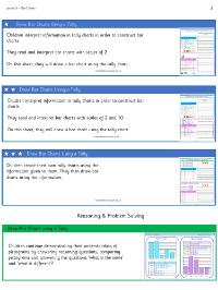
Further activities challenge students to apply their knowledge by creating bar charts from given data, such as the number of children attending different sports clubs or their favourite sweets. This hands-on approach helps students to decide on appropriate scales for their charts, whether they should increase by intervals of 1, 2, 5, or 10. Additionally, the resource prompts critical thinking through reasoning tasks where students must determine the most suitable format for data representation—whether a bar chart or a pictogram is more efficient for a given dataset. Finally, independent work sections ask students to identify errors in sample bar charts and to complete their own based on tally charts, reinforcing their skills in data interpretation and presentation.

