Statistics - Interpret pictograms 1-1 - Presentation
Maths Resource Description
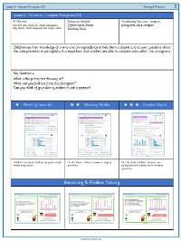
Students embarking on Lesson 5 of their statistics curriculum will delve into the interpretation of pictograms, a graphical tool used to represent data. The lesson's core objective is to enable students to read and answer questions about data presented in pictograms, where each symbol represents one unit, in this case, one vote or one mini beast. For example, they will be asked to determine the most and least popular choices among their peers, such as identifying the favourite jacket colour or meal in their class based on the pictogram provided. Additionally, they will calculate the difference in popularity between options and ascertain the total number of children or items represented in the pictogram.
Further activities challenge students to apply their understanding of pictograms to various scenarios. They will interpret data sets ranging from favourite colours of shorts to different types of mini beasts collected by a class. In these exercises, students will identify the most and least popular items and make numerical comparisons between them. The lesson also includes reasoning tasks, where students must evaluate statements related to pictograms and correct any inaccuracies. Independent work tasks encourage students to create their own pictograms and critically assess their classmates' interpretations, fostering a deeper comprehension of the data and enhancing their analytical skills.

