Statistics - Make tally charts 2 - Presentation
Maths Resource Description
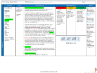
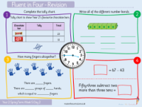
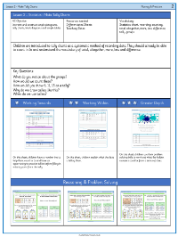
The lesson on creating tally charts is a practical introduction to presenting and interpreting data for students. They are encouraged to think about various types of data that can be collected, such as favourite colours, animals, or food, and how to represent this information using tally marks. The lesson begins with a discussion on what a tally is and where students might have encountered tally charts before. As they progress, students are tasked with completing tally charts by counting groups of items and translating these counts into tallies. For example, they record preferences for different colours, tallying up votes for green, orange, red, blue, and yellow, and then calculate totals to see which colour is the most popular.
Further activities delve deeper into the process of making tally charts. Students are asked to consider why tallies are grouped in fives and how to represent numbers like 6, 11, and 18 using tally marks. The lesson also prompts students to think about the contexts in which tally charts are useful, such as keeping track of classroom equipment or surveying favourite sports. In addition to creating tallies, students are encouraged to interpret the data, telling the 'story' of what the numbers reveal. For instance, they might look at a completed tally chart showing the number of students who prefer dogs, cats, fish, snakes, and rabbits, and deduce which animal is the most or least popular. The lesson aims to develop both the skill of accurately making tally charts and the ability to reason about the information they represent.

