Statistics - Interpret pictograms 2, 5 & 10 - Worksheet
Maths Resource Description
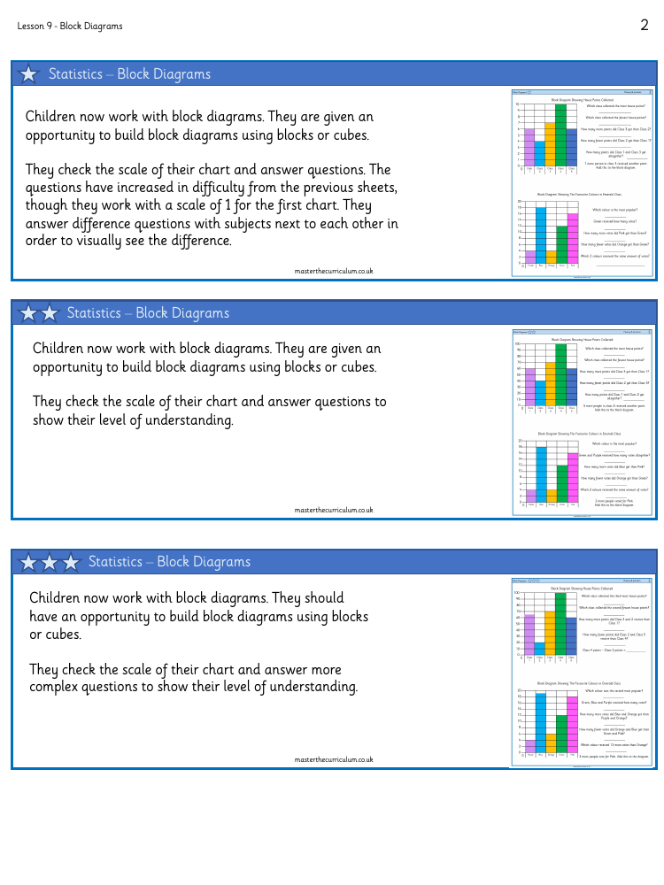
This worksheet provides an engaging introduction to interpreting block diagrams, a visual tool for representing statistical data. Aimed at enhancing students' data handling skills, the worksheet presents two scenarios: one tracking house points collected by different classes and the other surveying favourite colours in Emerald Class. Students begin with a block diagram scaled at 1, making it easier to compare quantities. They are tasked with identifying which class collected the most and fewest house points, calculating the difference in points between classes, and adjusting the diagram to reflect additional points awarded.
In the second part of the worksheet, students examine the popularity of colours among a group of students. The block diagram shows the number of votes each colour received, and students must determine the most and least popular colours, the exact number of votes for specific colours, and the difference in votes between them. The exercise also includes a practical element where students add votes to the diagram, simulating real-time data changes. This hands-on approach not only reinforces their understanding of block diagrams but also encourages critical thinking as they analyse and interpret the data presented.

