Max Maths, Year 5, Learn together, Review of drawing and interpreting frequency tables, pictograms and bar line charts

Maths Resource Description
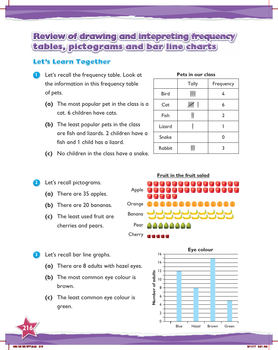
In Year 5, students review how to create and interpret various data representation methods, including frequency tables, pictograms, and bar line charts. The review begins with recalling how to read and understand a frequency table through the example of a class's pet ownership. From the table, students can identify that cats are the most popular pet, with six children owning them, while fish and lizards are the least popular, with only two and one child owning them respectively. The table also highlights that no children own a snake, providing a clear example of how frequency tables can convey information about quantities and preferences.
The lesson continues with a review of pictograms, using the example of fruits in a fruit salad to illustrate the concept. Students learn that pictograms use symbols or images to represent data, allowing them to easily see that there are 35 apples and 20 bananas, with cherries and pears being the least represented fruits. Finally, the review covers bar line graphs, with an example showing the distribution of eye colour among a group of adults. Students can see that brown is the most common eye colour, while green is the least common, with a bar graph making it simple to compare the numbers visually. This comprehensive review reinforces how different types of charts and graphs are used to organise and present data in a way that is easy to understand and interpret.