Statistics - Interpret Charts - Worksheet

Maths Resource Description
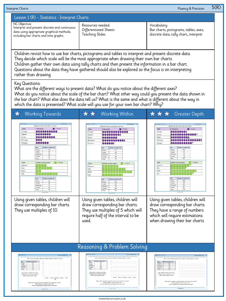
The lesson on interpreting charts is designed to help Year 6 students understand and present data using bar charts and time graphs, aligned with the National Curriculum objective. The lesson requires differentiated worksheets and teaching slides as resources, and focuses on key vocabulary including bar charts, pictograms, tables, axes, discrete data, and tally charts. Students revisit the use of these graphical methods to interpret discrete data, learning to select the most appropriate scale for their own bar charts. They are encouraged to gather data using tally charts and then represent it in a bar chart, with an emphasis on interpreting the data rather than just drawing it.
Throughout the lesson, students are asked to consider various questions about data presentation, such as differences in axes, the scale of bar charts, alternative data representation methods, and the relationship between different data presentation formats. They are tasked with drawing bar charts from given tables, using multiples of 10, 5, or other ranges that may require estimation. The lesson also includes reasoning and problem-solving activities where students critique and improve upon sample bar charts, ensuring the correct scales are used and all necessary chart components, like axis labels and titles, are included. This helps deepen their understanding of data interpretation and presentation.


