Statistics - Interpret Charts - Presentation

Maths Resource Description
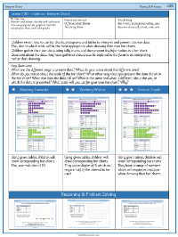
The educational resource provides a comprehensive set of activities designed to teach students how to interpret and create various types of charts, with a focus on bar charts. The initial lesson encourages students to transform data from pictograms and tables into their own bar charts, prompting them to consider the nature of discrete data. Students are tasked with examining bar charts that depict different modes of transport to school, such as walking, scooting, or taking a bus, and they must complete corresponding tables by extracting information from the charts. They are asked to identify the most and least popular transport methods and to consider other questions that can be derived from the data presented.
Subsequent activities guide students through the process of representing different sets of data as bar charts. They are invited to think critically about the appropriate scales for their charts and the importance of accurately labelling the axes. The exercises include a variety of scenarios, such as representing the number of cookies sold on different days of the week or the number of house points awarded to different teams. Reasoning tasks challenge students to justify their choices of data representation, whether it be a bar chart, table, or pictogram, and to evaluate the effectiveness of their chosen methods. The resource aims to develop students' statistical skills, enabling them to effectively communicate and interpret data through visual means.

