Statistics - Vocabulary
Maths Resource Description
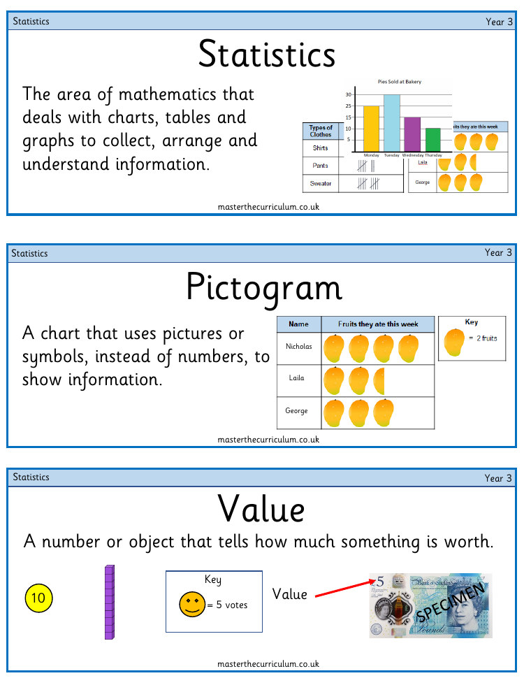
A pictogram is an engaging type of chart where images or symbols represent data, making it visually appealing and easier to understand, especially for Year 3 students. Each symbol in a pictogram corresponds to a specific quantity, and the key of the pictogram explains the value that each symbol represents. For example, a single icon might be used to represent five votes in a class election, with the key indicating this equivalence. Pictograms are a creative way to present information without relying solely on numbers.
On the other hand, a bar chart is a more traditional statistical tool that uses bars of varying heights to compare values across different categories. Each bar's height correlates to the value it represents, and these values are determined by the scale on the side of the chart. The scale is divided into intervals, which are consistent gaps between the lines on the scale, helping to quantify the data accurately. Tables and tally charts are other methods used to organize and display data in rows and columns, with tally charts using groups of lines to represent frequency efficiently. These visual representations aid in the interpretation of data, allowing students to determine the most and least popular choices among the collected information.