Statistics - Draw bar charts activity - Presentation
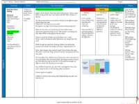
Maths Resource Description
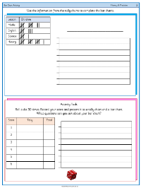
Today's lesson introduces the concept of bar charts, a method of presenting data visually. Pupils will explore what a bar chart is and discuss its features, such as its bars representing different values. The lesson revisits different data collection methods, including tally charts and pictograms, and emphasises the importance of a key. Students will examine a variety of bar charts, like one displaying Class 1's favourite ice cream flavours and another showing favourite sports in class 3R. Through these activities, they will learn to interpret the data, identify the most and least popular items, and understand the significance of a scale, which in some exercises counts in ones and in others by twos.
The lesson progresses with students analysing the data from a table showing points scored in a game, which they will then represent as a bar chart. They will decide on the most appropriate scale for the chart, understanding why scales that are too large or too small might not be suitable. The lesson also challenges students to place data points accurately on the bar chart when the exact number is not listed on the scale. Finally, pupils are given the opportunity to create their own bar charts using data provided and to formulate questions based on their charts. The lesson culminates in a practical exercise where students roll a dice 30 times, record the results in a tally chart, and then convert this data into a bar chart, further solidifying their understanding of this statistical tool.