Statistics - Introducing line graphs - Presentation

Maths Resource Description
In a presentation aimed at introducing students to the concept of line graphs, the focus is on interpreting and plotting data that represents changes over time. Students explore the advantages of using line graphs to present continuous data, such as temperature readings throughout a morning in March. They are encouraged to discuss how line graphs provide a visual representation of data trends and how to read and interpret specific points on the graph, such as determining the temperature at 10 a.m. or identifying the warmest and coldest times of the day. Additionally, they learn how to estimate values at times not explicitly marked on the graph, like 11:30 a.m., and to deduce the time corresponding to a particular temperature, such as 5 degrees.
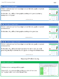
The lesson continues with activities that involve creating line graphs from given data sets. One example includes data on the weekly growth of a plant, where students are asked to decide on appropriate scales for the x and y axes and to plot the plant's height over six weeks. This activity helps to differentiate line graphs from bar charts by emphasising their application to continuous data as opposed to discrete data. To further develop reasoning skills, students are presented with scenarios, such as the flight path of a toy rocket, and tasked with creating stories that match given line graphs. They also critique inappropriate uses of line graphs, like representing the number of dogs in a park, where discrete data would be better represented by a bar chart or pictogram. The presentation concludes with independent work where students complete tables and plot their data on line graphs, solidifying their understanding of this statistical tool.


