Bar Charts - PowerPoint
Maths Resource Description
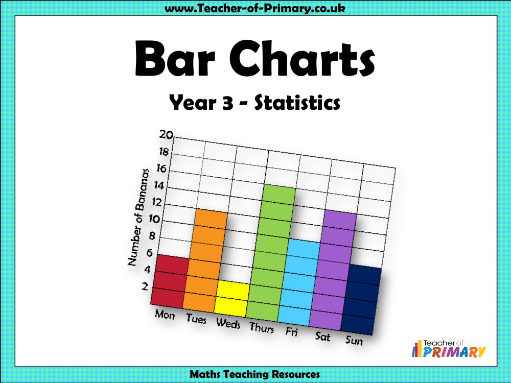
A bar chart is an effective visual tool used to represent data with bars of varying heights, allowing for quick comparison and analysis. For example, a bar chart can illustrate how many bananas a monkey named Malcolm ate on different days of the week, making it easy to identify the days on which he ate the most or the least bananas. The importance of selecting an appropriate scale for a bar chart is emphasised, as the scale can vary in increments such as twos, fives, tens, or hundreds, depending on the data set. This choice of scale is crucial for making the data clear and interpretable. An example provided shows a scale increasing in increments of two, which can impact the accuracy of reading data if misunderstood.
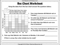
Worksheets accompanying the lesson prompt students to use the data from a bar chart to answer various questions, such as the number of bananas Malcolm consumed on a specific day or identifying the days where his banana intake exceeded a certain amount. Another exercise involves creating a bar chart based on given data about the number of cars of different colours in a car park, and then using the completed chart to answer questions about the most and least popular car colours, the difference in numbers between colours, and the total count of cars. The worksheets also include scenarios where common mistakes are highlighted, such as misinterpreting the scale or the tally system, helping to reinforce correct data interpretation and chart reading skills.