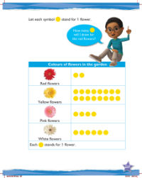
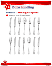
Max Maths, Year 2, Learn together, Making pictograms (6)
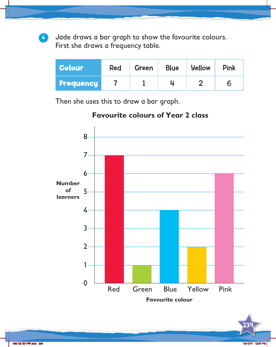

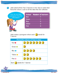
In a Year 2 mathematics lesson, Jade takes on the task of representing her classmates' favourite colours using a bar graph. To begin, she meticulously organises the data into a frequency table, which is a crucial step in understanding the distribution of preferences among her peers. This table lists the colours red, green, blue, yellow, and pink, alongside the number of learners who favour each one. The frequencies are recorded as follows: red is favoured by 7 learners, green by just 1, blue by 4, yellow by 2, and pink by 6.
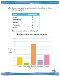
Using the information from the frequency table, Jade then constructs a bar graph. This visual representation is titled 'Favourite colours of Year 2 class' and clearly displays the popularity of each colour among the learners. The vertical axis of the graph represents the number of learners, ranging from 0 to 8, while the horizontal axis lists the colours. Each colour is represented by a bar, the height of which corresponds to its frequency in the table. For instance, the bar for red reaches up to the number 7, reflecting the seven learners who chose red as their favourite, while the bar for green is the shortest, indicating its lower popularity with only one vote. This bar graph provides an immediate visual comparison of the favourite colours, making it easier for the students to understand and interpret the data.