Statistics - Draw pie charts - Presentation
Maths Resource Description
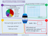
Students embarking on Lesson 7 of their statistics module will delve into the world of pie charts, a graphical representation that displays data in a circular format. The lesson begins with a discussion about the sum of angles around a point, which is a fundamental concept when it comes to drawing pie charts. Understanding that there are 360 degrees around a point helps students in constructing pie charts accurately. They will apply this knowledge to convert various data sets, such as the popularity of different fruits or modes of transport used by classmates, into pie chart segments. Each segment's angle corresponds to the percentage that each category represents in the total data set.
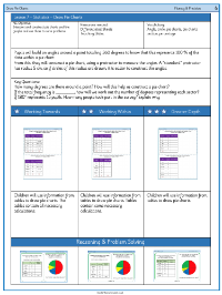
As the lesson progresses, students will tackle a series of activities designed to enhance their fluency and reasoning skills in the context of pie charts. They will be tasked with converting numerical data, such as the number of children preferring certain sports or Sunday dinners, into degrees to create pie charts. These activities not only cement their understanding of the relationship between percentages, fractions, and angles but also encourage critical thinking as they work out missing information and represent comprehensive data visually. Additionally, students will explore how to determine the difference in popularity between options, such as the number of pupils preferring different crisp flavours, by calculating the angle differences in the pie chart.
