Statistics - Draw pie charts - Planning
Maths Resource Description
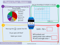
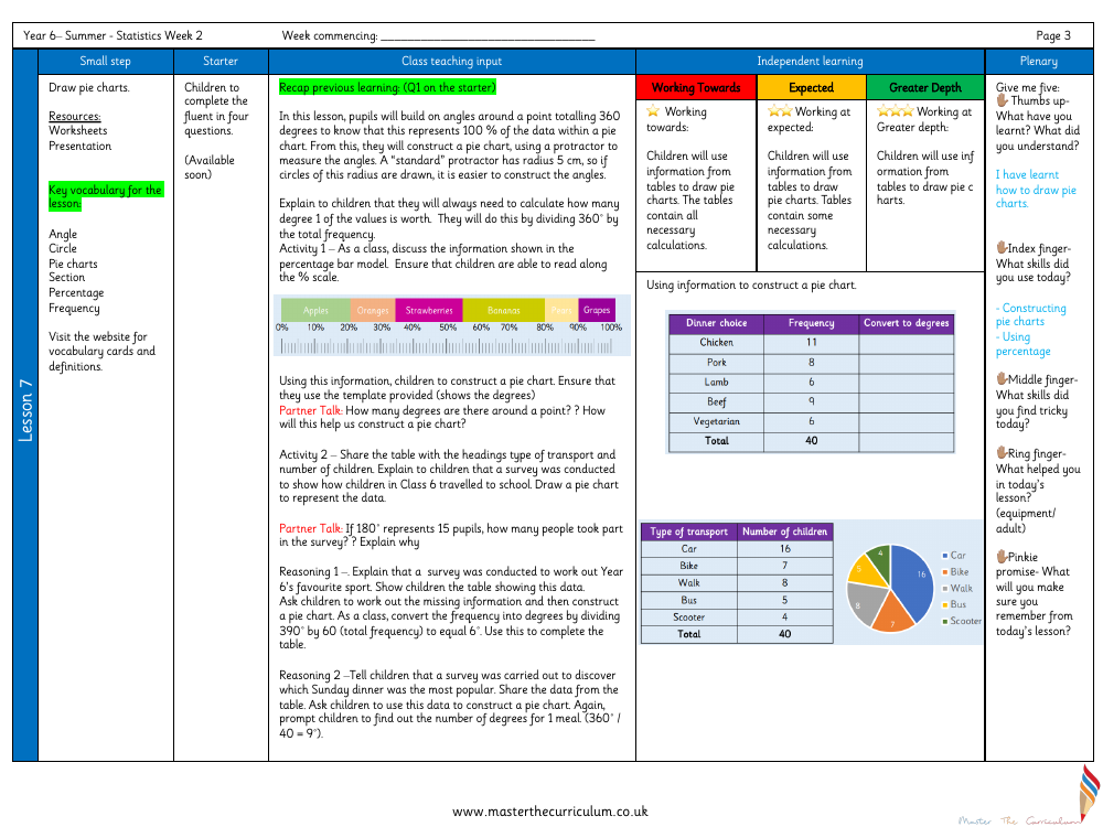
In a comprehensive lesson plan for Year 6 pupils, the objective is to learn how to draw pie charts effectively. The lesson begins by revisiting the concept that the angles around a point total 360 degrees, which equates to 100% of the data in a pie chart. Students are taught to use a protractor, ideally on a 5 cm radius circle, to measure the angles accurately. They learn to convert frequencies into degrees by dividing 360 degrees by the total frequency of the data. The class works through an example using a percentage bar model to understand how to read and scale percentages, and then they apply this knowledge to construct a pie chart with the help of a template that shows the degrees.
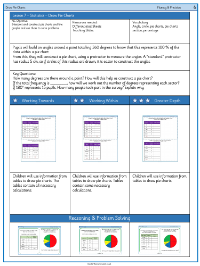
Further activities involve interpreting data from tables, such as types of transport used by pupils to travel to school, and drawing corresponding pie charts. Through partner discussions and guided reasoning tasks, students practice converting frequencies into degrees and understanding the proportionality of the pie chart sections. They are challenged to work out missing information and to use their findings to create accurate pie charts. The lesson also addresses potential misconceptions around percentages and reinforces the skills needed to translate survey data into visual representations. Pupils reflect on their learning, discussing what they found challenging and helpful, and they make a "pinkie promise" to remember the key points of drawing pie charts. Differentiated learning outcomes cater to varying levels of understanding, from working towards the expected level to achieving greater depth in interpreting and representing data.
