Statistics - Read and interpret pie charts - Presentation
Maths Resource Description
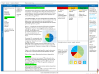
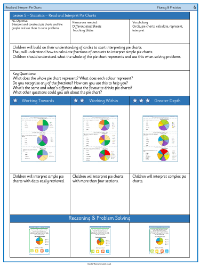
The lesson on reading and interpreting pie charts is aimed at enhancing students' ability to analyze and draw conclusions from data presented in this circular statistical graphic. A pie chart is a visual tool used to represent data, where the whole chart is a circle that is divided into slices to illustrate numerical proportions. Students are encouraged to consider why a pie chart might be more appropriate for certain data sets than a line graph or other types of charts. The lesson includes activities where students apply their knowledge to real-life scenarios, such as determining the number of students at Copingham Primary School who use different modes of transport to get to school, based on the information provided in a pie chart.
Further activities involve analyzing a pie chart created from a survey on favourite outdoor activities, where students must calculate percentages and identify the most and least popular activities. Another exercise requires students to deduce the total number of survey participants based on the given data, such as inferring the total from a known quarter. Additionally, students explore a pie chart about favourite pets, where they practice calculating proportions and creating questions for their peers. Independent work challenges students to calculate quantities related to modes of transport, types of animals, and preferred fruits. The lesson encourages discussion on the significance of the whole pie chart, the meaning of each slice, the recognition of fractions, and the comparison of different pie charts.
