Statistics - Draw line graphs - Planning
Maths Resource Description
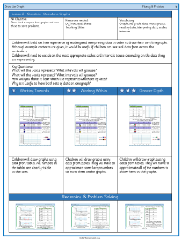
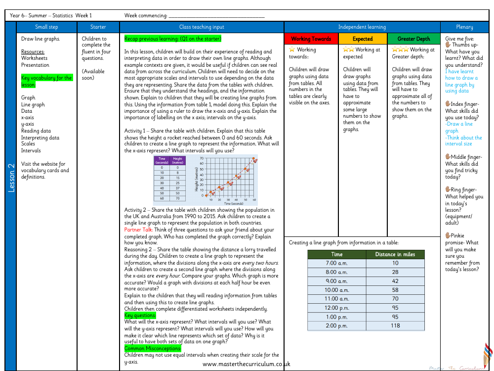
In a Year 6 summer term lesson focusing on Statistics, students are tasked with learning how to draw line graphs. The lesson is designed to enhance their abilities in reading and interpreting data by engaging them in creating line graphs from provided data sets. Initially, the lesson recaps prior knowledge before moving on to class teaching input where the importance of selecting appropriate scales and intervals for the data representation is emphasized. Students are instructed on how to accurately draw and label the x-axis and y-axis, and the significance of using a ruler for precision. The lesson then transitions to independent learning, where students are given tables with various data such as the height a rocket reached over time or population changes in the UK and Australia, and they are asked to represent this data in line graph form, deciding on the most suitable intervals for their x-axis.
Throughout the lesson, students engage in different activities that challenge them to think critically about how to best display the data. They are encouraged to ask questions about their completed graphs and to understand which graph provides the most accurate representation of the data, considering different intervals on the x-axis. The lesson also includes a plenary that addresses common misconceptions, such as the incorrect use of equal intervals on the y-axis. The lesson concludes with a reflection activity, prompting students to consider what they have learned about drawing line graphs, the skills they have used and found challenging, and the support that helped them during the lesson. Differentiated worksheets cater to varying levels of understanding, from working towards expected standards to achieving greater depth, where students must approximate numbers to fit them onto their graphs.
