Max Maths, Year 3, Try it, Bar graphs
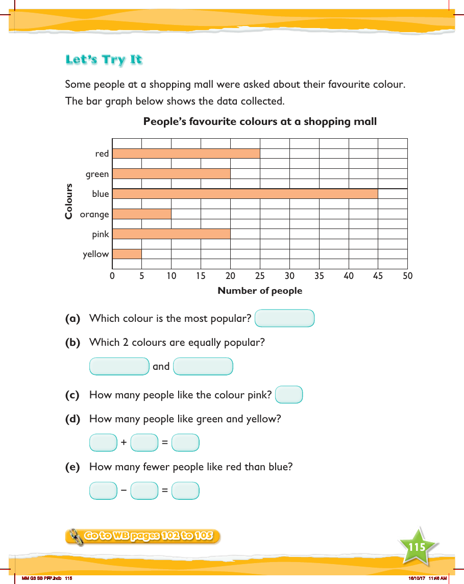
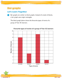
In a Year 3 mathematics exercise from Max Maths, children are introduced to interpreting bar graphs through a practical example. The scenario provided is a survey conducted at a shopping mall to determine people's favourite colours. A bar graph is presented to the students, displaying the popularity of various colours including red, green, blue, orange, pink, and yellow. The vertical axis of the graph represents the number of people, while the horizontal axis lists the colours. Students are asked to analyse the graph to answer several questions about the data.
The questions are designed to help students practice reading and extracting information from the bar graph. Question (a) asks which colour is the most popular, requiring students to identify the tallest bar. For question (b), they must find which two colours have bars of equal height, indicating equal popularity. Question (c) prompts them to determine the exact number of people who prefer pink by looking at the corresponding bar's height. In question (d), students are asked to add the number of people who like green and yellow, while question (e) challenges them to calculate the difference in popularity between red and blue. To further their practice, students are directed to workbook pages 102 to 105 for additional exercises on the topic.