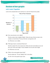
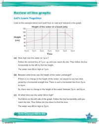
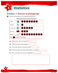
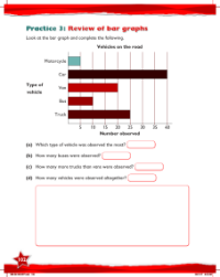
Max Maths, Year 6, Learn together, Review of pictograms, block graphs, bar graphs and line graphs (1)
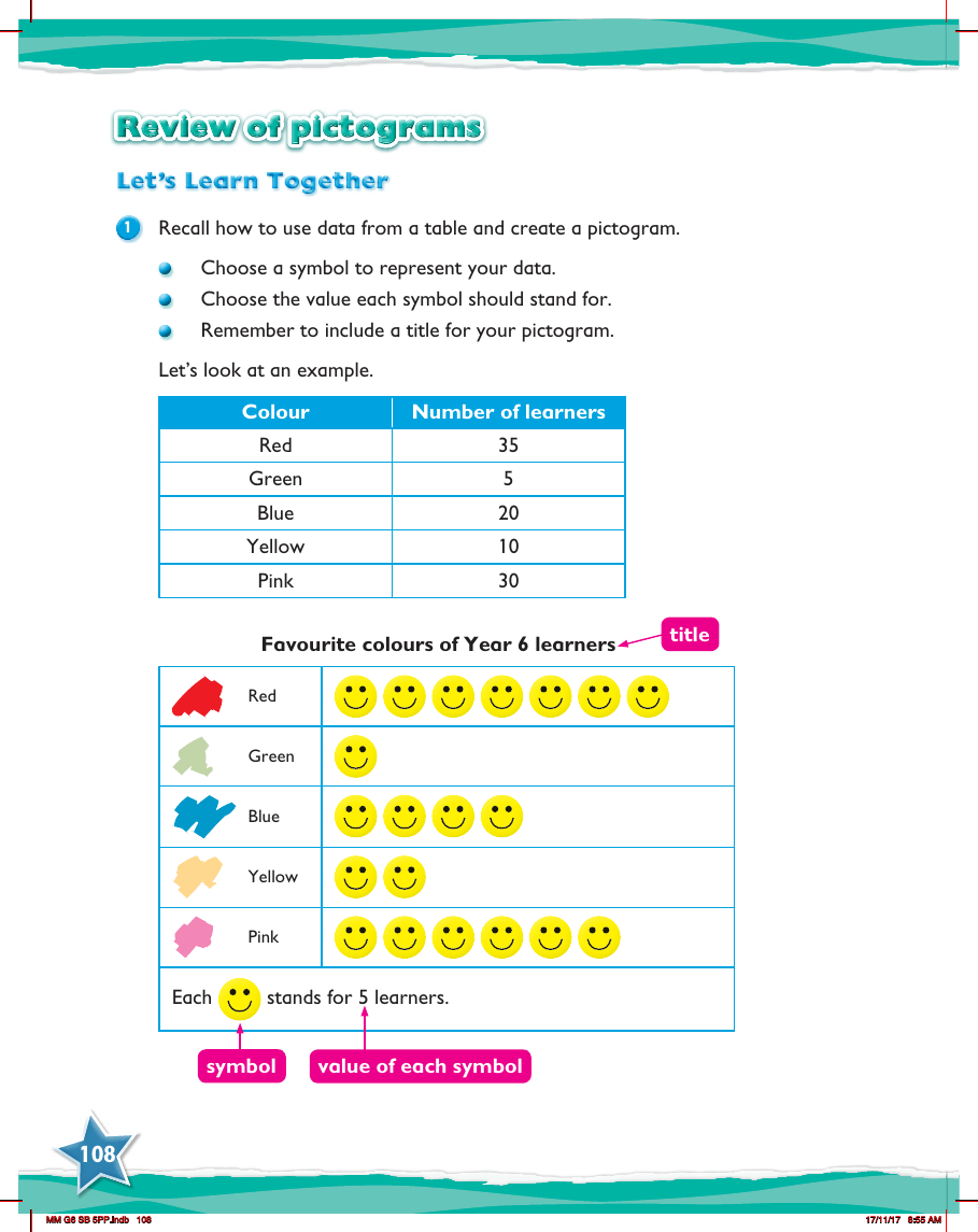

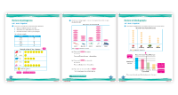
In the "Max Maths, Year 6" curriculum, students revisit the concept of pictograms as a graphical representation of data. They are encouraged to recall the process of converting data from a table into a pictogram. The key steps involve selecting an appropriate symbol to depict the data points and assigning a value that each symbol will represent. It is also crucial for students to give their pictogram a clear title, which communicates the theme of the data being represented. This ensures that the information is easily understandable to anyone viewing the pictogram.
An illustrative example provided to the students includes a table listing various colours along with the number of learners who favour each one. The colours mentioned are red, green, blue, yellow, and pink, with corresponding numbers of learners preferring each colour. In the pictogram, a specific symbol is chosen to represent a set number of learners, in this case, each symbol stands for five learners. By arranging the symbols in rows corresponding to each colour, students can visually compare the popularity of each colour among Year 6 learners. The pictogram is then completed with a title such as "Favourite Colours of Year 6 Learners," and a key explaining the value of each symbol, ensuring clarity and ease of interpretation.